Treatment effects your analysis programs can actually find.
Analysis datasets and the outputs built on them are programmed months before any data arrives, and usually tested on data with no signal in it. Verdatic lets you build the treatment difference in on purpose — per field, per arm, previewed before generation — so the derivations that matter get exercised on data where you already know the answer.
The problem
Analysis datasets and the outputs built on them are programmed months before there is any data to run them against. So they get tested against whatever is available: a handful of hand-made rows, a previous study’s extract with the wrong structure, or dummy data with no signal in it at all.
- Data with no signal proves almost nothing. A change-from-baseline derivation runs cleanly on flat data and on wrong data alike. Subgroup logic, visit windows, responder flags and dropout handling all pass when there is nothing to get wrong.
- Degenerate test data hides real defects. Constant values, one visit per subject, no missingness, no discontinuations — exactly the conditions your programs will never meet and your bugs are hiding behind.
- The first real extract becomes the first real test. Which puts pipeline rework in the busiest week of the study, not the quietest.
- Design questions get asked too late. “What if we add an arm, widen the window, change the schedule?” is a planning conversation when it should be a five-minute experiment.
Risk and cost profile
We don’t publish savings percentages, and there is no benchmark study behind this page. These are the drivers; your rates and your study history are the inputs.
The cost here is mostly displaced time rather than wasted time. The analysis programming still gets done — it just gets done later, under more pressure, by people who are simultaneously answering questions about live data. Work that could have been finished and reviewed in a quiet quarter lands in the loudest one.
| Cost driver | How it shows up | Price it with your own numbers |
|---|---|---|
| Analysis code with nothing to run on | Derivations and flags are proven syntactically, then properly tested at first data. | programmer-weeks that can’t start until real records exist |
| Degenerate test data | Flat or single-visit data can’t exercise change-from-baseline, windows or dropout. | count the derivations you couldn’t truly test on your last study |
| First-data-in rework | The first real extract is also the first honest test of the pipeline. | days of rework, in the weeks you have least of them |
| Blinded dry runs | Without a modeled effect there’s nothing to blind — and nothing to test blinding against. | see the masking use case |
| Late design questions | Adding an arm or shifting a window is a planning exercise rather than an experiment. | hours to re-plan on paper, against minutes to re-simulate |
What we won’t claim: Verdatic does not write your tables, listings and figures, and it does no statistics — no models, no p-values, no estimands. It builds the signal into the data so that the programs which do those things can be written, run and reviewed early. Simulated effect sizes are a design input you chose, never evidence about a compound.
The workflow, at a glance
An arm is a label, an allocation ratio and — optionally — its own schedule. Each subject is randomized to one, and each field can carry a per-arm setting: how much it should move from visit to visit, and in which direction. Everything else about the field is inherited, so the difference between arms is exactly the difference you declared.
The Verdatic workflow
Real screens from the product — and the exact vocabulary the product uses, which is deliberately mechanical: arms, drift per visit, a maximum percentage change per visit.
Define the arms and how subjects land in them
An arm has a label, an allocation ratio shown as a percentage, an active flag and an optional schedule requirement — leave the schedule blank and the arm applies to any of them. Randomization happens per subject in proportion to the ratios, and the assignment is carried on the subject record, so the arm follows that patient through every dataset and stamps the treatment variables and the trial-design rows in the standards output.
Set the effect where the effect belongs — on the field
Open a numeric field and there are two numbers that matter: drift per visit, a signed value where the sign is the direction, and maximum change per visit, which governs how noisy the path is. Set them once for the study, then open per-arm overrides and give the active arm its own. Blank cells inherit, so a placebo arm that overrides nothing simply behaves like the base study — and the separation between the two is precisely what you typed.
Being exact about the model: the drift is a constant step applied at each visit, with a random draw around that target and clamping to the field’s bounds. It is not a per-visit effect curve, and Verdatic does not ask you for an effect size, a treatment model or an estimand — the vocabulary is deliberately closer to “how much does this move” than to statistics.
Preview it before a single record exists
The same dialog runs a preview on demand: subject trajectories with the mean and a one-standard-deviation band, the final-visit distribution against the theoretical curve, the visit-to-visit percentage change against the limit you set, and — when the study has arms — a mean-per-visit comparison of each arm against the universal setting. It includes edits you haven’t saved yet, so tuning is a conversation with a chart rather than a generate-and-inspect cycle.
Generate, then look at what the setting produced
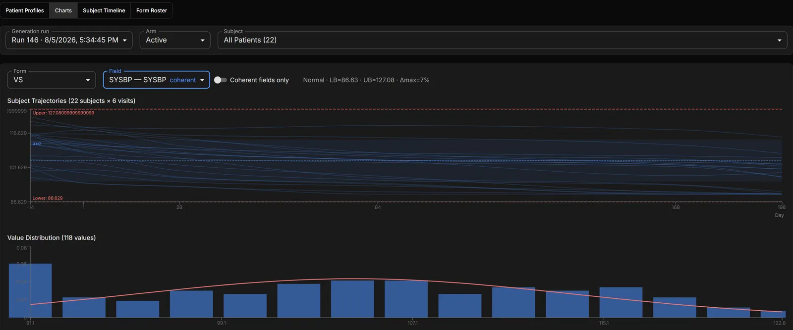
After a run, the charts lens shows the real thing: every subject’s trajectory for a chosen field, filtered to one arm, with the distribution of the generated values against the theoretical curve underneath and the field’s configured model spelled out along the top.
Check it holds up at the patient level
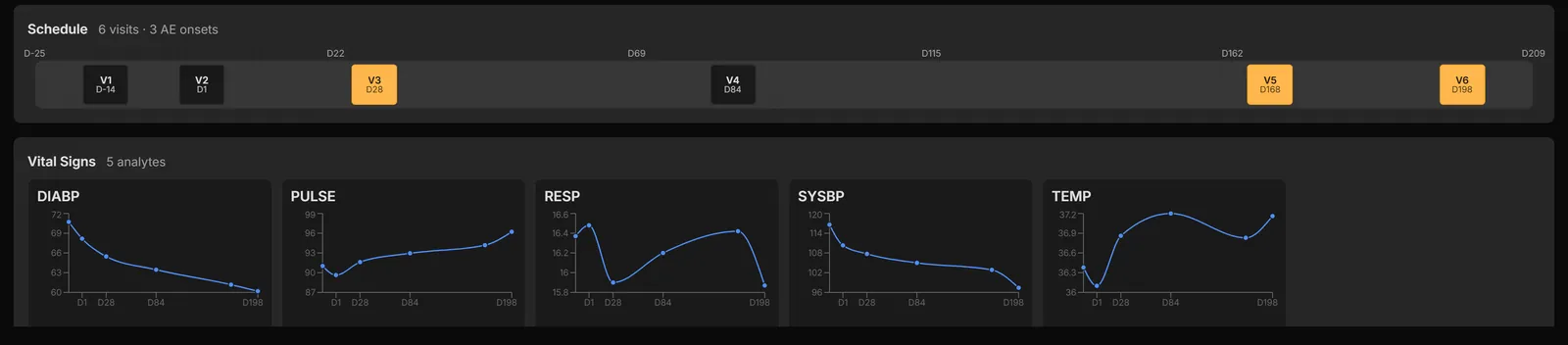
A treatment effect that only exists in aggregate isn’t much of a test. Individual subject profiles show the arm’s effect alongside everything else that has to stay believable — measurements that wander the way real ones do, events that start after dosing, treatments that follow the events they answer.
Add the imperfections your programs have to survive
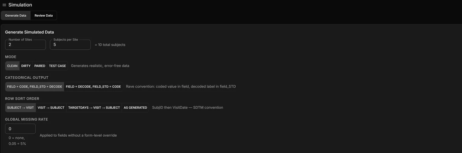
A clean signal is only half a test. At project level you can set a dropout mechanism — completely at random, dependent on an observed covariate, or dependent on the unobserved value — with a per-visit dropout rate and a between-site variation term. Per field there are distribution choices, missing and blank rates, ranges, and an intra-visit offset pattern. And any run can be generated deliberately dirty, so the pipeline meets the kind of data it will actually be given.
Carry it into the analysis layer
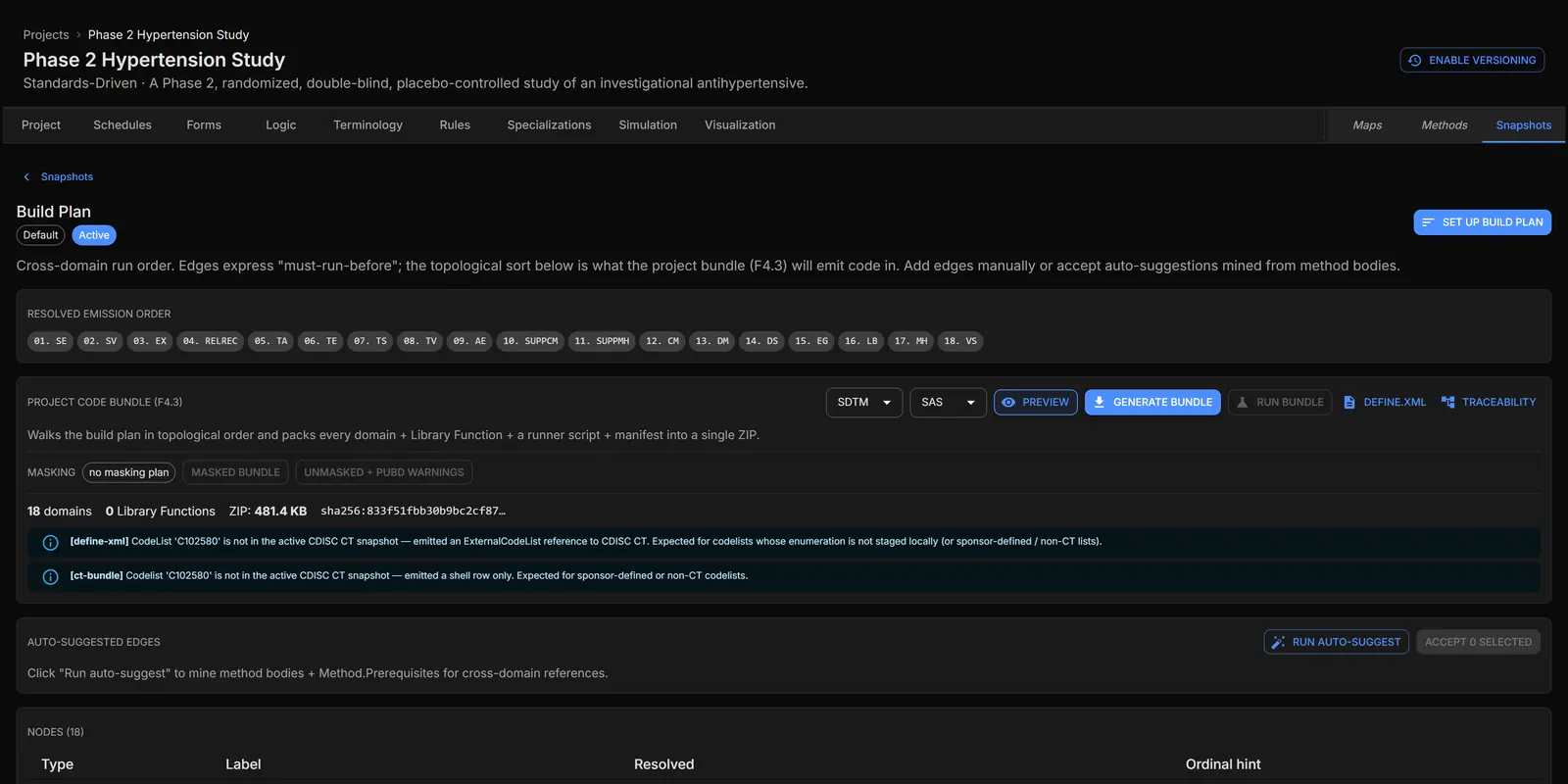
The generator produces the collected and tabulation data; the analysis datasets are derived from it by programs Verdatic writes — a subject-level dataset with its treatment and population flags, basic data-structure datasets for findings carrying parameter, visit, baseline, change and percent-change variables, and occurrence datasets for adverse events, medications and medical history. Analysis datasets are bundled separately from the tabulation ones, each with its own Define.xml, and the bundle can be executed in place for R and Python.
That is the point of modelling the effect in the first place: your baseline flags, your change-from-baseline and your visit windows get exercised on data where the answer is known, because you chose it.
Executive summary
- The problem. Analysis datasets and outputs are programmed long before there is data with any signal in it, so the derivations that matter most are the ones tested least.
- The cost. Displaced rather than wasted: the work lands at first-data-in, in the busiest weeks of the study, instead of the quiet ones.
- What Verdatic does. Arms with allocation ratios and per-subject randomization; a signed drift per visit and a maximum change per visit set on each field, overridable per arm, with blanks inheriting.
- See it before you build it. A preview charts arm against arm — including unsaved edits — and after generation the charts lens shows every subject’s trajectory for the arm you pick, against the configured model.
- The honest boundary. No tables, listings or figures, and no statistics of any kind. Verdatic puts the signal in the data so the programs that do that work can be written and tested early — on synthetic data, never as evidence about a compound.
Pick an endpoint and watch it move.
A good first session is one endpoint from a study you know: set the drift, preview the arm comparison, generate, and run your own derivation against the result.
Request accessOr email [email protected]. If the analysis has to stay blinded, the masking use case covers the other half.
The other three use cases